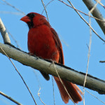
Have you ever considered what a wondrous thing it is to see color? In spring I get to enjoy the vivid green of my pasture, the bright red of the cardinals as they feast on the insects trying to eat my pasture, the mixed reds and yellows of my wife’s roses, even the black and brown of Sundae as she races to welcome me home.


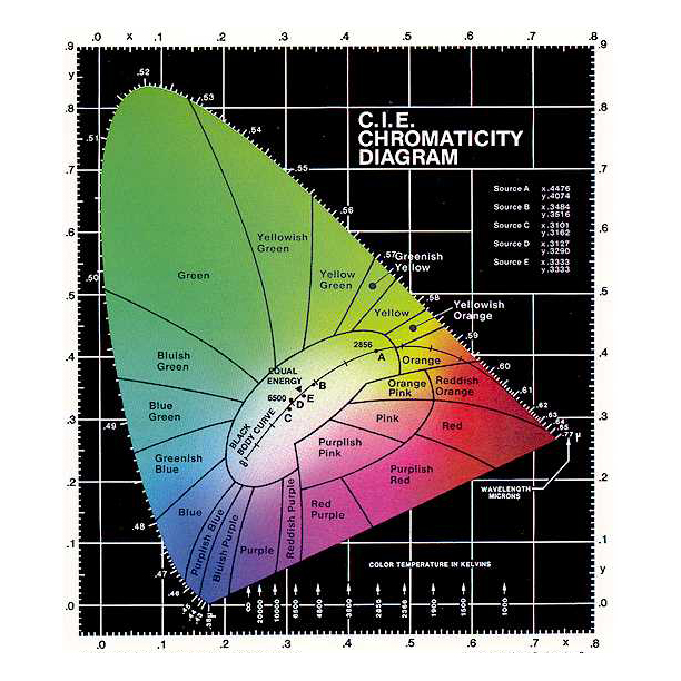
As you read this post, you see a number of colors on my webpage. Reproducing color on your television or monitor has been discussed a number of times but I’ll try to cover the basics. In painting, you start with three primary colors, Red, Yellow and Blue and by mixing the primary colors, you’re able to come up with all the other colors. Somehow mine always came out brown but that’s a different story. On your TV and monitor, color is broken into the Red, Green and Blue components.
When I want to specify a color in HTML, I set the intensity for each color component using a six digit number. The first two digits represent the red intensity, the next two the green intensity and finally, the blue intensity. Just to keep it easy for the programmer, these numbers are in hexadecimal format.
Wikipedia breaks it down far better than I can but if I want red text I specify <font color=”#ff0000″> Bright red</font>. If I raise the green intensity to half of the red, I get <font color=”#ff800″> Not bright red</font>. Hmm, looks like brown again, sometimes I think the universe is laughing at me. Read the Wikipedia article.
Wikipedia also has a nice article on how we see in color. Not surprisingly, it’s very similar to the way we manage to do it with technology. The eye has photo receptors that are sensitive to three different color bands. The response intensity of the different photo receptors are integrated and interpreted as a specific color by the brain.
So much for science. The repeatability of this allows most of us to agree on the basic definitions of color. We can agree that red is red, green is green, fuschia is, well I’ve never really figured out what fuschia is.
This gets really interesting as you start to consider the variability of the photo receptors. from person to person. The sensitivity for each type of photo receptor will vary from person to person, as will the color band for each of the photo receptors. Putting numbers to this, when I look at green grass, my photo receptors might be measuring 18, 45, 70. When you look at the same green grass, your photo receptors might be measuring 22, 40, 60. We both agree it’s green because we’ve always been told it’s green but in reality we each see it differently.
Just to add to the complexity of this, the way your mind stores this relationship varies from person to person. I think this is where color preference comes in. The way this information is stored and the way your photo receptors respond varies enough from person to person that it’s just possible we all like the same pattern. We interpret that pattern as different colors.
If you stay with the idea of patterns, it’s easy to realize that some patterns will complement others and some patterns will clash with others. Since we store the patterns differently for each color, while we believe that color preference is a matter of choice, it’s simply a matter of how our photo receptors choose to respond to the color and how our minds store the data.
And that, my dear wife, is why I felt it was perfectly reasonable to wear my orange tie with my pink shirt last night.
© 2013 – 2019, Byron Seastrunk. All rights reserved.


Recent Comments