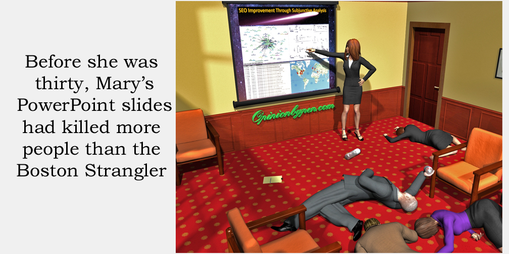
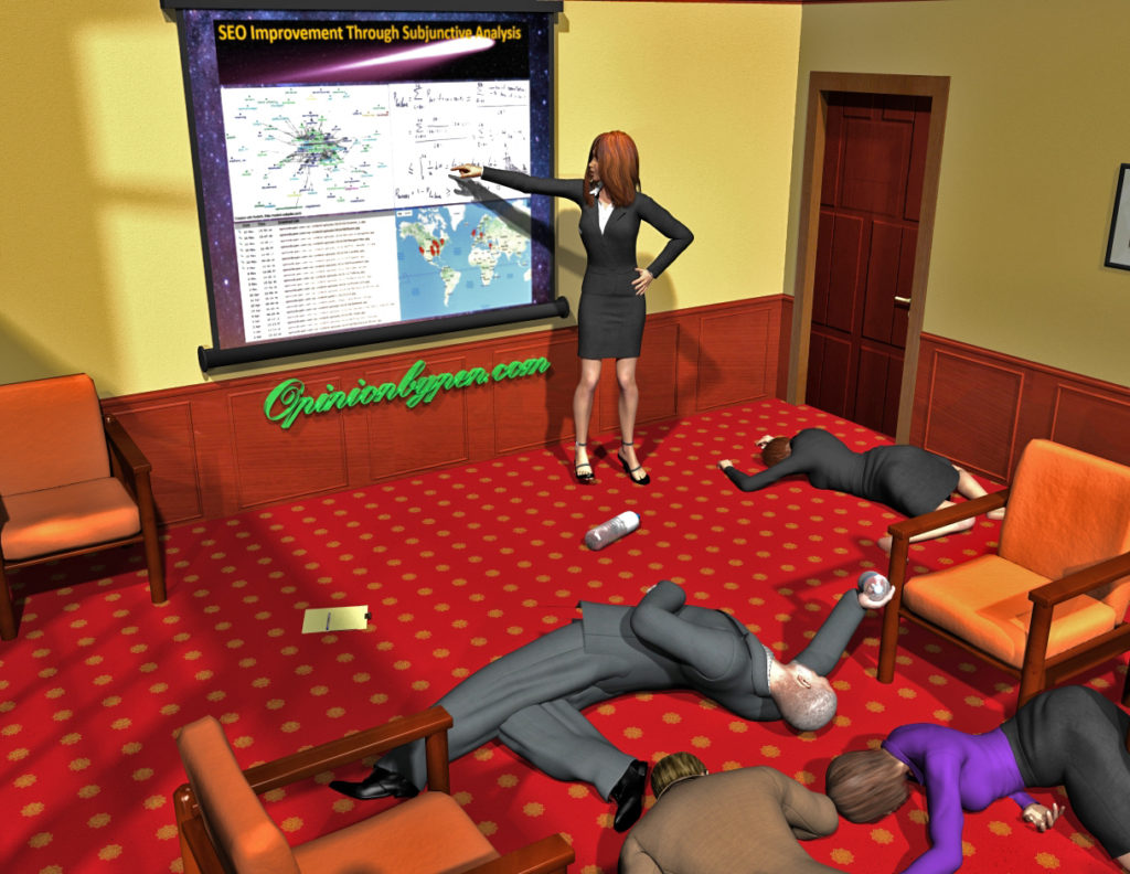
We’ve all heard the term, Death by PowerPoint. If you work in an office environment, odds are you’ve come to hate PowerPoint presentations. Surprisingly, I’m not going to attribute this to Microsoft. No, the blame for this hatred lies solely with us, the creators of the slide deck. I’m going to let you in on a great secret, tell your audience what’s important to them, not what’s important to you.
Why do I believe that’s a secret? Well, unless the majority of PowerPoint authors are sadists intent on using their mind numbing presentations to totally remove our will to live (and I’m not discounting that yet), this simple guideline seems totally lost on them. They fill side after slide with marginally related factoids that are probably interesting to, well, maybe only the author.
Let me give you an example. NASA has just discovered that a huge asteroid is going to impact the earth. Due to recent budget cuts, they can only spare one man and select their chief astronomer to create the PowerPoint slides briefing the public on this event.
His presentation goes something like this:
- On May 18, I identified and plotted the trajectory for Thorby’s Rabbit, named in accordance with NASA practices.
- Thorby’s Rabbit measures just over 5 miles in diameter with an estimated mass of 7 billion tons
- IR reflection indicates a surface of ice, although spectrometry suggests a high nickel iron content
- Speed is approximately 25 kps and accelerating slightly
- Based on the current speed and direction, it should enter earth’s atmosphere at approximately 26 kps.
If any of that was even vaguely useful to you, we need to have a long discussion. You can tell almost as much about the author as you can about the asteroid (high ego, once chastised for ignoring NASA naming practices, doesn’t see the big picture). The fact that you can’t really comprehend 200 kilotons or 25 kps, aside from big and fast, never entered his mind.
Thorby’s Rabbit? Who cares if it was named in accordance with NASA practices? All you care about can be summed up in four questions. Is it going to hit? When? What damage will the impact cause? Should I max out my credit cards now?
Fortunately for us, NASA has some really great PR people and decided that the announcement needed some improvement. Here’s the improved announcement.
- Huge meteor expected to hit Earth!
- Asteroid will arrive on August 22
- Impact will be 300,000 megaton explosive yield
- NASA is currently exploring options
Certainly better but again falls far short of what people want to hear. What the heck does 300,000 megaton yield mean anyway? At some point, numbers become meaningless. Astonishingly, despite this being a life or death issue, the announcement will also lose credibility with the scientific community simply because the author doesn’t know his meteors from his asteroids. It’s an asteroid until it encounters earth’s atmosphere. Maybe we need a few more people on the team. Let’s try again.
- Huge asteroid expected to hit earth on August 22
- Impact will cause instant death for 70% of population in Southern Hemisphere
- Loss of sunlight from ash and debris from impact will kill most plant life and cause temperatures to drop by 50 degrees for next 20 years
- Less than 1% of world population expected to survive
- World organization looking at mitigation methods
Answers most of my questions but again, most of us can’t really relate to what’s being said, we’ll all assume we’re part of the one percent that survive. After all, we have artificial light and heaters. We could survive. Yes, I know it’s a false hope but many of us can’t comprehend what life would be like without our technology. Let’s try one more time but this time focus on the audience.
- You are about to die!
- A huge asteroid will collide with earth on August 22
- US, Russia and China are now working together to deflect it but they need money
- Send money now to World Asteroid Deflection Fund and we might avoid impact
- If you’re a rocket propulsion engineer or nuclear physicist, we already know about you
- If you’re an alien with unimaginable technology at hand, now would be a good time to initiate first contact
Yes, it’s blunt but it gets the point across and gives you some hope. Please, for all our sakes, next time you put together a PowerPoint deck, think of your audience. Think about this post and craft something your audience wants to see. The difference will amaze you. Together, we can eliminate death by PowerPoint.
© 2017 – 2019, Byron Seastrunk. All rights reserved.


I have seen Powerpoint presentations much worse than anything. The fonts were hard to see even if it was displayed on big screen. The presentations are always done on big screen, so the size of fonts are important. I’ve seen
people were using fancy fonts. I hated it. I have done few PP presentation, and I always try to keep it simple, easier to read and use pictures that are relevant.
LOL…..I’m guessing you must have sat through a PP presentation recently! Have absolutely nothing to contribute to your blog except you made me laugh.