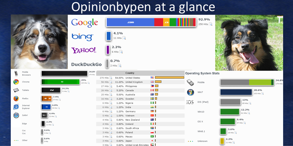
If there’s an engineer in your life, you know how utterly fascinated we are by data. We use data to make purchases, to troubleshoot and to make important decisions. In How to Argue with an Engineer, I told you how engineers use data to support our arguments. It should come as no surprise to you that I frequently review my website data.
I can see that I started losing you the moment I mentioned data. I know I can’t expect you to show the same interest I do but give me a few minutes to show you why this data is so interesting. While you’re granting me a few more moments of your time, I’m going to point out that I haven’t mentioned metrics. Yes, metrics are a form of data but the concept of metrics has been so misused that I automatically discount anyone that starts talking about metrics.
That’s not to say metrics are bad or that anyone talking about metrics is clueless but you have to admit the metrics community seems full of idiots. Sorry, I was soapboxing, let’s look at my website data.
It should be an obvious truth that before you make use of any data you need to understand where it came from and what it represents. The data used to make these charts represents approximately two weeks of visitors to Opinionbypen. I used a WordPress plugin, StatCounter, to create all the nice graphics.
First we’ll take a look at how my visitors found me.
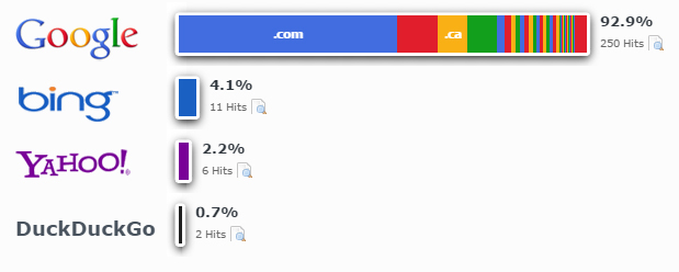
Hmm, seems fairly obvious who’s winning the search engine wars and why I want my SEO crafted to improve my Google rankings. If I were trying to make money on my site, there’s very little question where I would spend my advertising dollars.
It’s not quite as obvious why I would care about which browsers are used when viewing my site. Sadly, not all browsers are equal and when I make changes to Opinionbypen, I have to test the changes with a number of browsers. This gives me a good idea which browsers I need to test.
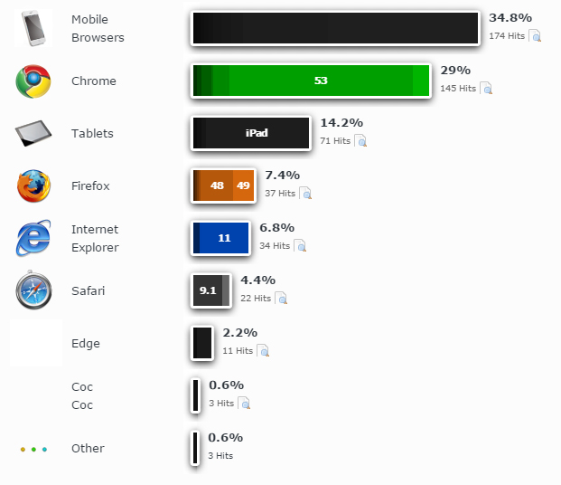
Notice that almost half of my visitors are using a tablet or a mobile phone. This is a big shift from five years ago. It’s also the reason the Google has added mobile friendliness to the criteria used to develop your SEO score.
Maybe I should take a closer look at the mobile browsers.
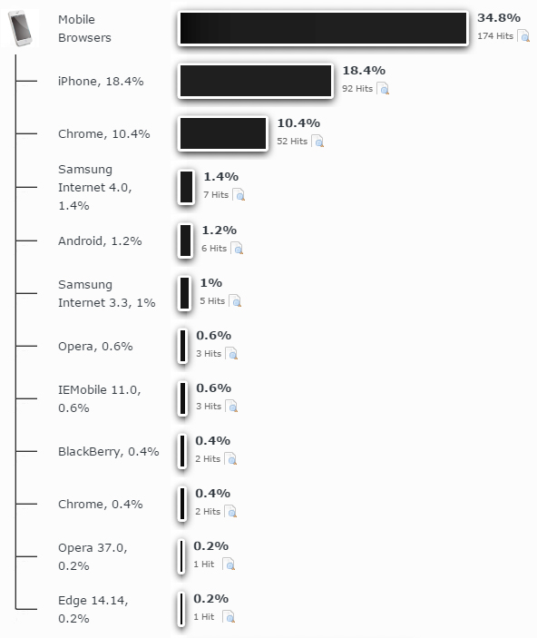
Looks like slightly over half of my smartphone visitors are using iPhones. Since I have no intension of every owning an iPhone, I’d better stay on good terms with my Mother-in-law so she can tell me if my site has a problem.
Come to think of it, I spend a lot of time doing full screen graphics. Maybe I should consider how people are seeing my graphics.
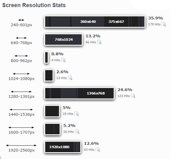
I shudder to think how some of my graphics look to someone viewing them on a screen with a 360 by 640 resolution. Some of the details I spend so much time getting exactly right probably aren’t even visible. I’m not going to change yet but I need to start considering the lower resolution.
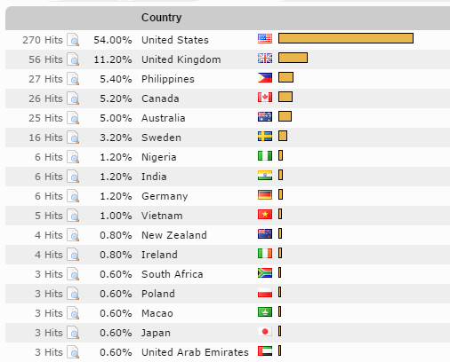
While we’re discussing data, one of more amazing things about my website is the number of foreign visitors I get. I need to explain that this data only represents human visitors. If you added in all the bots probing my site for weaknesses, China and several former Soviet bloc countries would top the list.
I’m presenting this last bit of website data because I find it amusing.
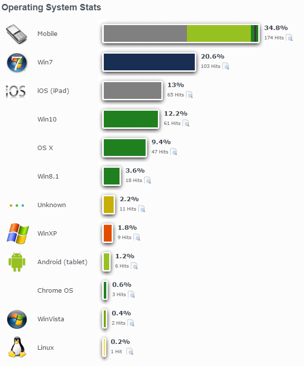
Wondering if you were the only holdout in the great Windows 10 giveaway? Apparently not. Despite the almost criminal efforts of Microsoft to get us to give up Windows 7 and embrace Windows 10, the data says they weren’t nearly as successful as they would have us believe.
And you were wondering why engineers find data so fascinating. Truthfully, we engineers wonder how you manage to ignore how fascinating it is.
© 2016 – 2019, Byron Seastrunk. All rights reserved.


Recent Comments