
My collection of bad drives
During the Christmas and New Year’s holiday’s I was doing research on hard drive failures when I came across the white paper by Google on hard drive failures. It’s a really nice breakdown of hard drive failure statistics. A few caveats before I get into the details, the paper was presented in 2007, based on drives produced in 2006 and earlier. Technology has come a long way, I hope that includes reliability.
What makes the Google report interesting is the large number of drives involved in the study. While the study does not indicate the number of drives, the size or a breakdown by manufacturer, the document gives enough information to suggest a wide variety.
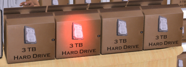
One of the statistics that was of special interest to me, after the first sector reallocation, a drive is 14 times more likely to fail within 60 days than a drive without a sector reallocation. I have a 3TB drive that just reallocated three sectors. I promptly removed it and I’ll put it back in service after the critical period has passed, 60 days from now.
Before you stop reading completely, I realize that’s not what the data suggests. I used this as an example because all of it’s true (except for me removing the drive but I will be watching it closely) and the response I described is a perfect example of the misuse of statistics that the Udacity Statistics course tried to teach.
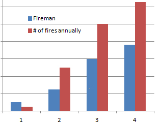
It’s obvious, more firemen, more fires.
When I took the Udacity course, I thought I was already well acquainted with statistics. The course is designed as an introduction and covers the basics quite well. It had enough new material to keep me interested but I never felt challenged. To my surprise, now statistical relationships are much sharper and I tend to think about the statistics behind a stated fact.
In one of the early lessons our instructor started by showing the correlation between cities with large numbers of fires and the number of firemen employed by them. The conclusion was obvious, if you had a lot of firemen in your city you were going to have a lot of fires. The data was very clear on this relationship. As part of our homework we were to come up with cases where statistics were being misused and post it in the forums.
The Google report also suggested that monitoring the SMART status of the drive was almost useless in predicting failure. Close to 50% of their drives failed without a single SMART event. There was one comment on the report saying that SMART was still effective. It still predicted half the failures. Hmm, is a test that only predicts correctly 50% of the time actually effective? That was covered during the first two modules in the Statistics course.
One in four failed is not always a 25% failure rate.
As I was looking for a 3TB drive to replace my current one, I saw one review that was very negative. The reviewer, having bought four drives with one of them DOA, gave the drive the lowest possible rating. Their reason was that no manufacturer should have a 25% failure rate. More statistics to consider.
While I agree that no manufacturer should have a 25% failure rate, the rest of their data was meaningless. Even assuming a 1 in 4 failure rate, they had a 1 in 256 chance to get 4 good drives. They would have had a 1 in 3 chance to get all four drives bad.
What does the reviewer’s dead drive tell him? How confident should he be in his data? Should I completely avoid this brand of drives based on his experience? Udacity’s course on statistics has answers for all of these questions and more.
In this time when pseudo statistics are used to convince you to buy one product over another and carefully crafted polls are being used as overwhelming proof of political mandates, we all need a better understanding of statistics.
Take the Udacity course. I’m 100% sure I enjoyed it.

© 2013 – 2019, Byron Seastrunk. All rights reserved.


Recent Comments